It’s February so of course we have to talk about designing with red for obvious reasons! Red can feel contemporary, traditional, rustic or timeless, depending on the shade and context.
Red plays a big role for the people of Columbus. Having The Ohio State University in the heart of the city creates strong ties to the school. The colors of the college include scarlet, which influences people’s spaces in the area because of their passion for the Buckeyes.
Read on to join me, Laura Watson, Development Manager at The Cleary Company Remodel-Design-Build in Columbus Ohio for tips on using red as a design element for your home.
Psychology of Red
Red is BOLD. Red is POWERFUL. Red is PASSIONATE.
It’s important to start by explaining why colors in general are important in a room and to the human eye. Color affects everyone differently and can influence how a person feels in a space. A color isn’t just a color, which is why it’s beneficial to understand them. Red is a color that brings out strong emotion and energy.
Reds have been used in interior design for centuries. It’s considered a lucky color and is associated with Christmas and Valentine’s Day. The color evokes celebration, emotion, and love. To read more about the psychology of colors check out this article.
Red is a Loud Color
It can be intimidating, which can steer people away from using it. When used incorrectly it can overstimulate you. How about using it as a bold statement that creates a focal point in a room. When used correctly it can really elevate a space and make it feel more luxurious. Try utilizing red for an accent wall, with artwork, pillows, and/or accessories. Another way is implementing pops of red in fabrics.
Red is a Warm Color
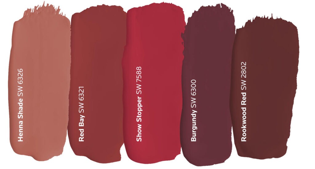
Joining cooler tones like beige colors can balance human feelings. There are many different shades of red from hot red to dark maroon to choose from. While the brighter shades of red generate more energy, darker ones tend to show a softer side that’s subtle and conservative. Consider a rich burgundy or brick red when designing for a space where the atmosphere is warm and welcoming, like a dining room.
Material Inspiration Board
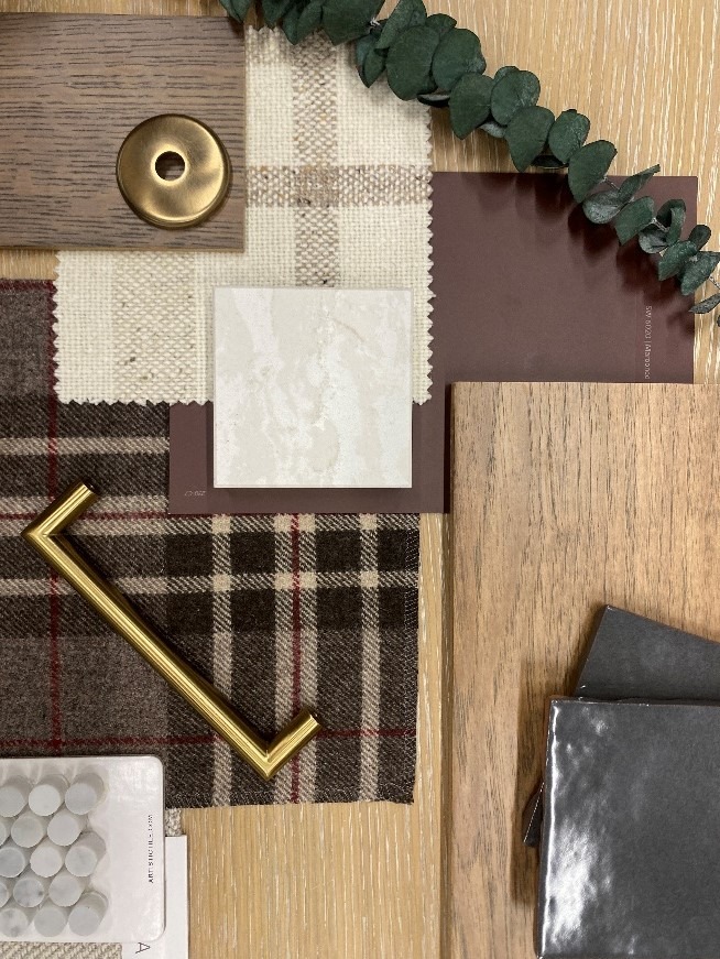
Showing different hues of red and layering of material can create a lavish space. The pops of color are balanced out with neutral colors. This allows for the space to feel more relaxed and calming. Another element used on the board is texture of materials. Create interest between the materials moving your eyes through the wood, tiles, metals, and fabrics.
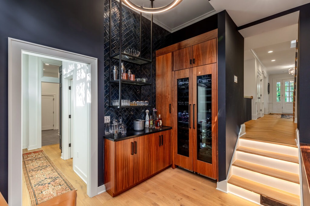
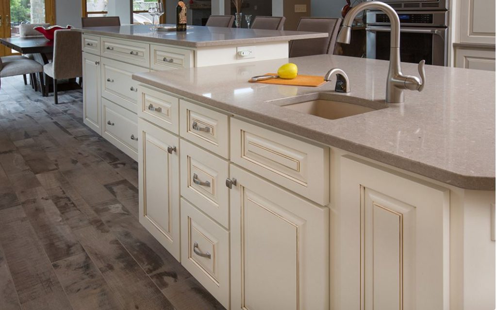
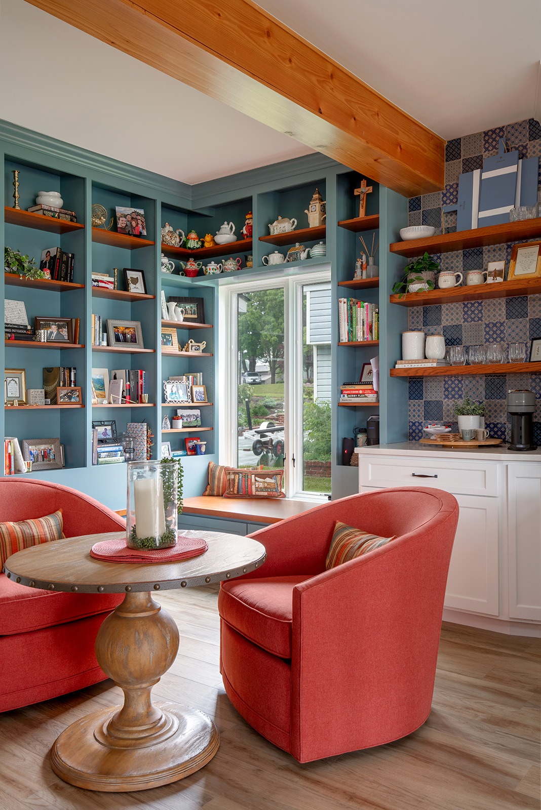
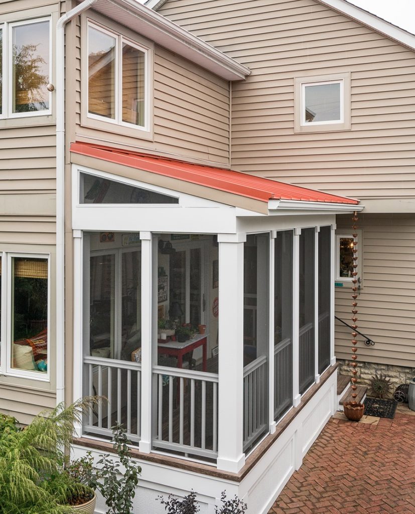
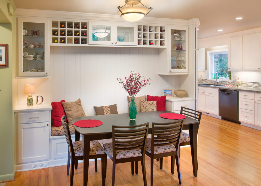
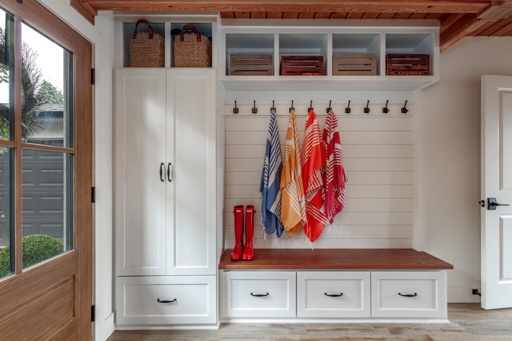
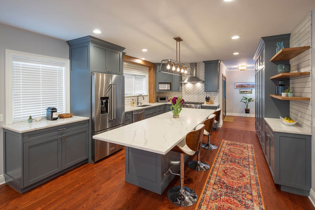
Projects with Pops of Red by The Cleary Company

Have a favorite shade of Red? Share it by sending me an email!
Ready for a Home Remodel in Columbus, Ohio?
Our Remodel-Design-Build Team is ready to collaborate with you on your next project. Get started today by contacting our Client Relations Coordinator! Call 614-459-4000 or visit our website.